Many physiotherapy logos lack distinction, including the current PMPP design, making brand differentiation challenging. As competitors in Melbourne increasingly adopt more unique and innovative identities, a refreshed logo will allow PMPP to better reflect its individuality and strengthen its competitive position.
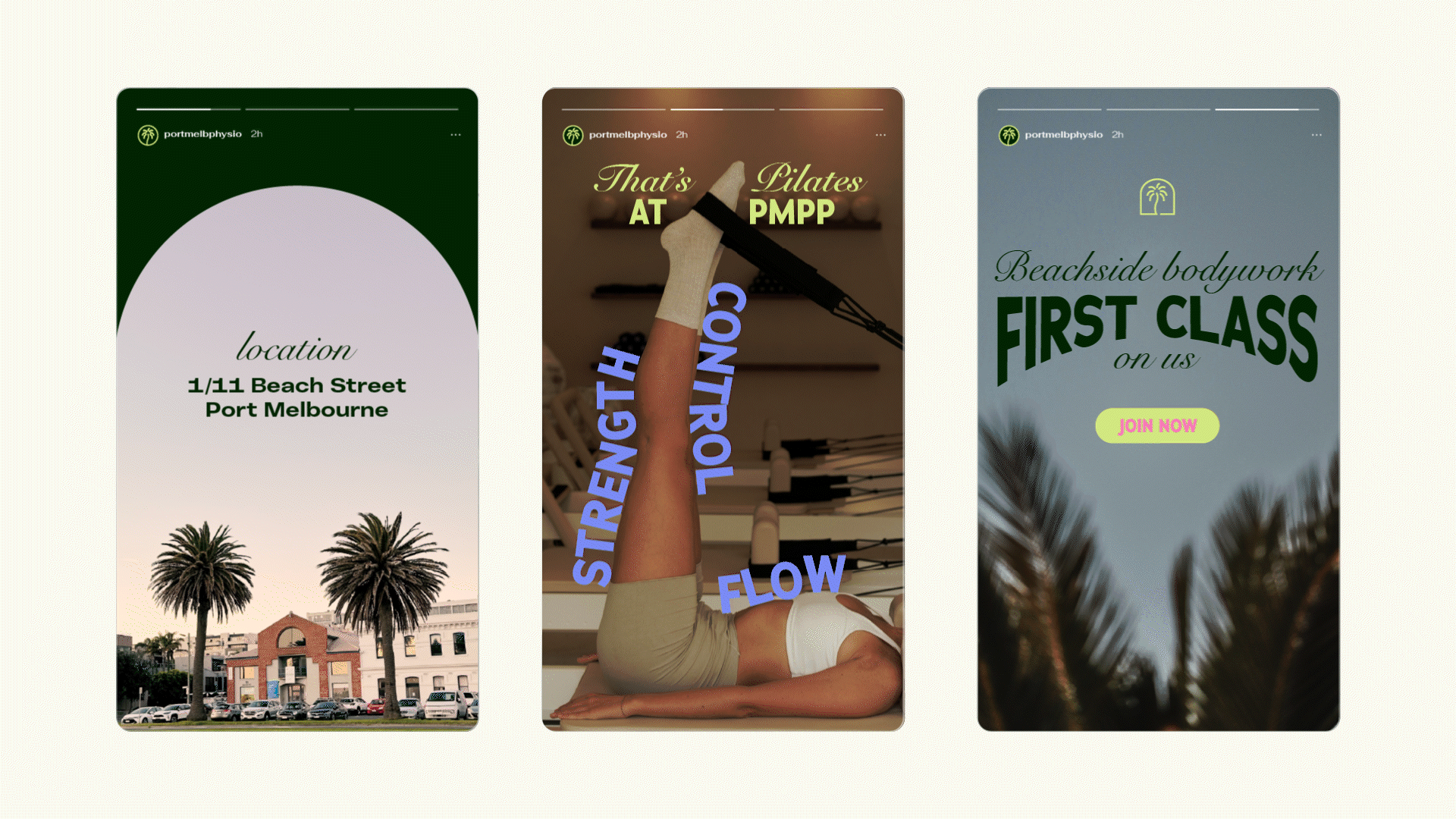
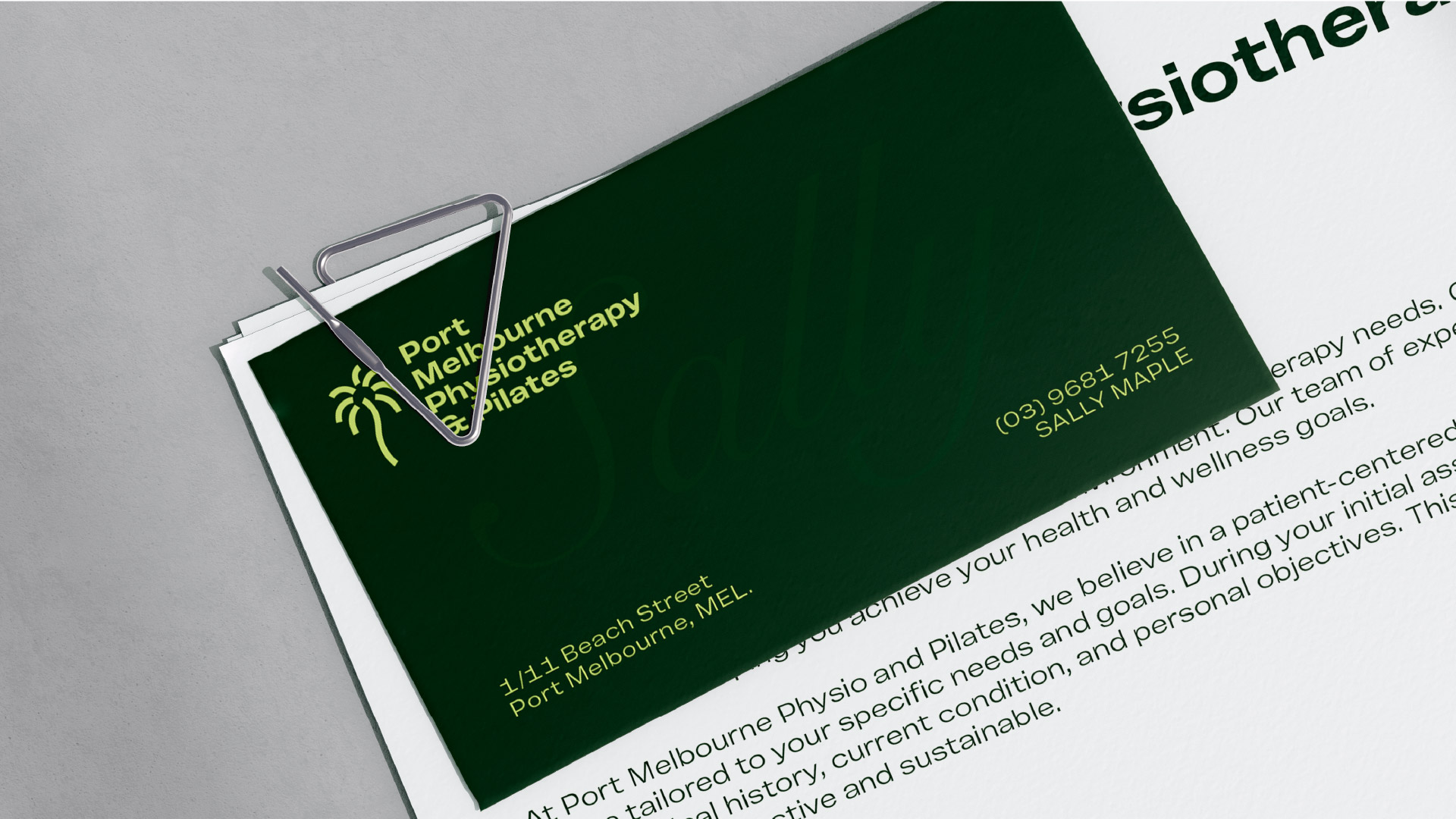
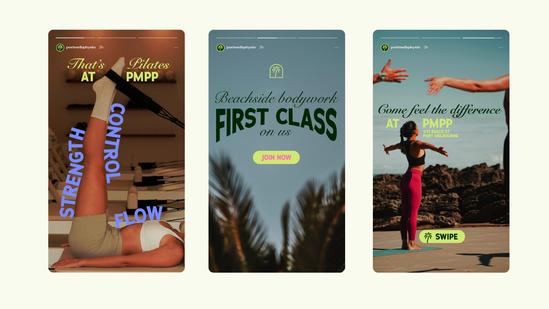
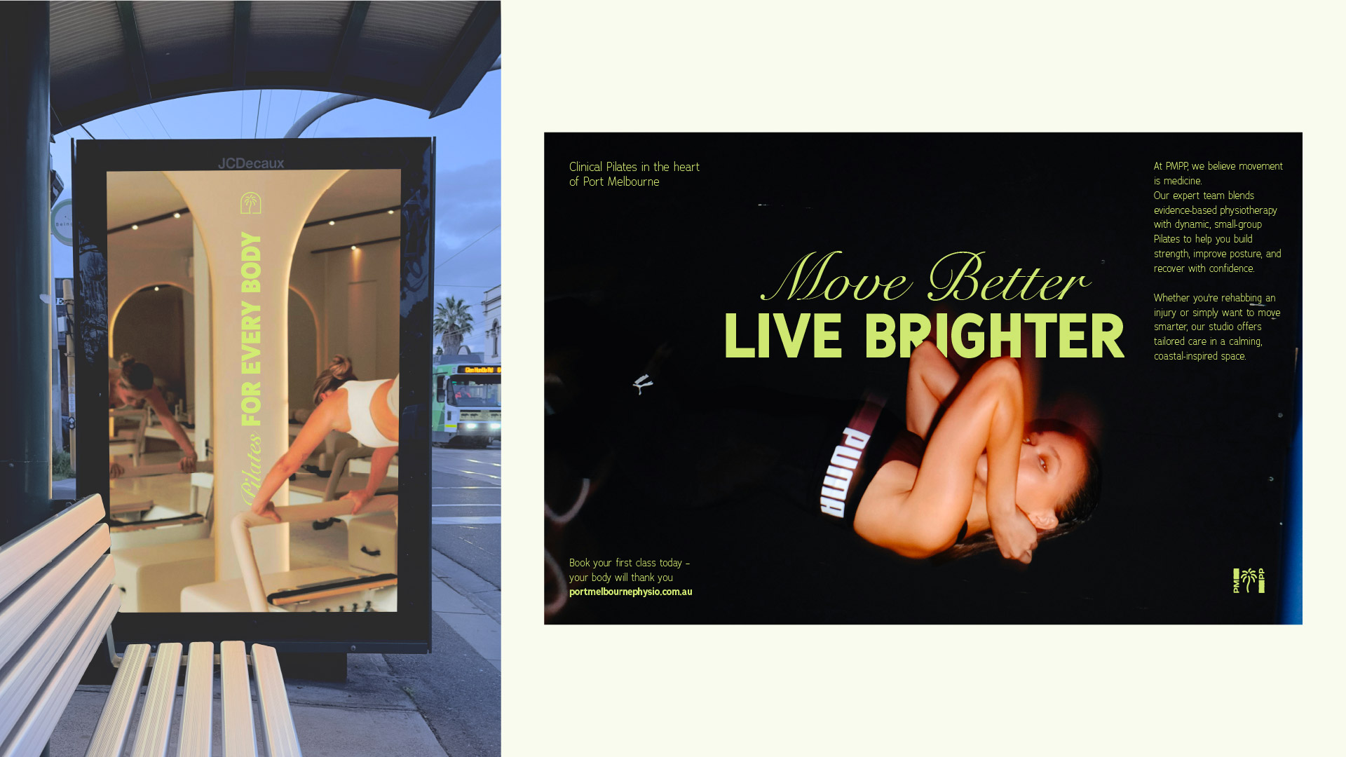
Unique to PMPP: Located in scenic Port Melbourne, PMPP draws inspiration from its coastal surroundings and iconic palm trees—symbols of natural movement and calm. With a young, dynamic team, the brand embraces modern design, vibrant colours, and contemporary typography to reflect a fresh approach to physiotherapy and Pilates. These elements help PMPP stand out and express its unique identity.
New Identity:
The new identity captures PMPP’s essence through natural elements and a sense of movement. A minimalist design featuring clean lines, modern sans-serif typography, and a nature-inspired palette—greens with vibrant pink and violet accents—creates a scalable, memorable identity that reflects the brand’s values and enhances recognition.